The Payment Succeeded. The User Panicked Anyway.
A time-aware checkout that reduced payment support tickets by 27% during peak UPI traffic.

Client
Bureau ID
Product
Blaze Checkout
Year
2022
Timeline
2 weeks
Role
Sole Product Designer
Team
1 Product Manager 2 Engineers (FE+BE)
At a glance
Problem
During peak UPI traffic, 3–5% of payments showed delayed confirmations, flooding support with "payment stuck" complaints from first-time buyers.
Solution
A time-aware confirmation screen with a shopkeeper character whose expression shifted as wait time grew. Acknowledged uncertainty instead of appearing frozen.
Result
27.41% fewer payment-related support tickets across 12 merchants during the Republic Day sale.
Context
Bureau's Blaze Checkout powered payments for 23 D2C merchants on Shopify and WooCommerce. 97% of users were first-time buyers on unfamiliar brands, meaning trust was fragile by default. UPI was the dominant payment rail. I owned the checkout experience end to end.
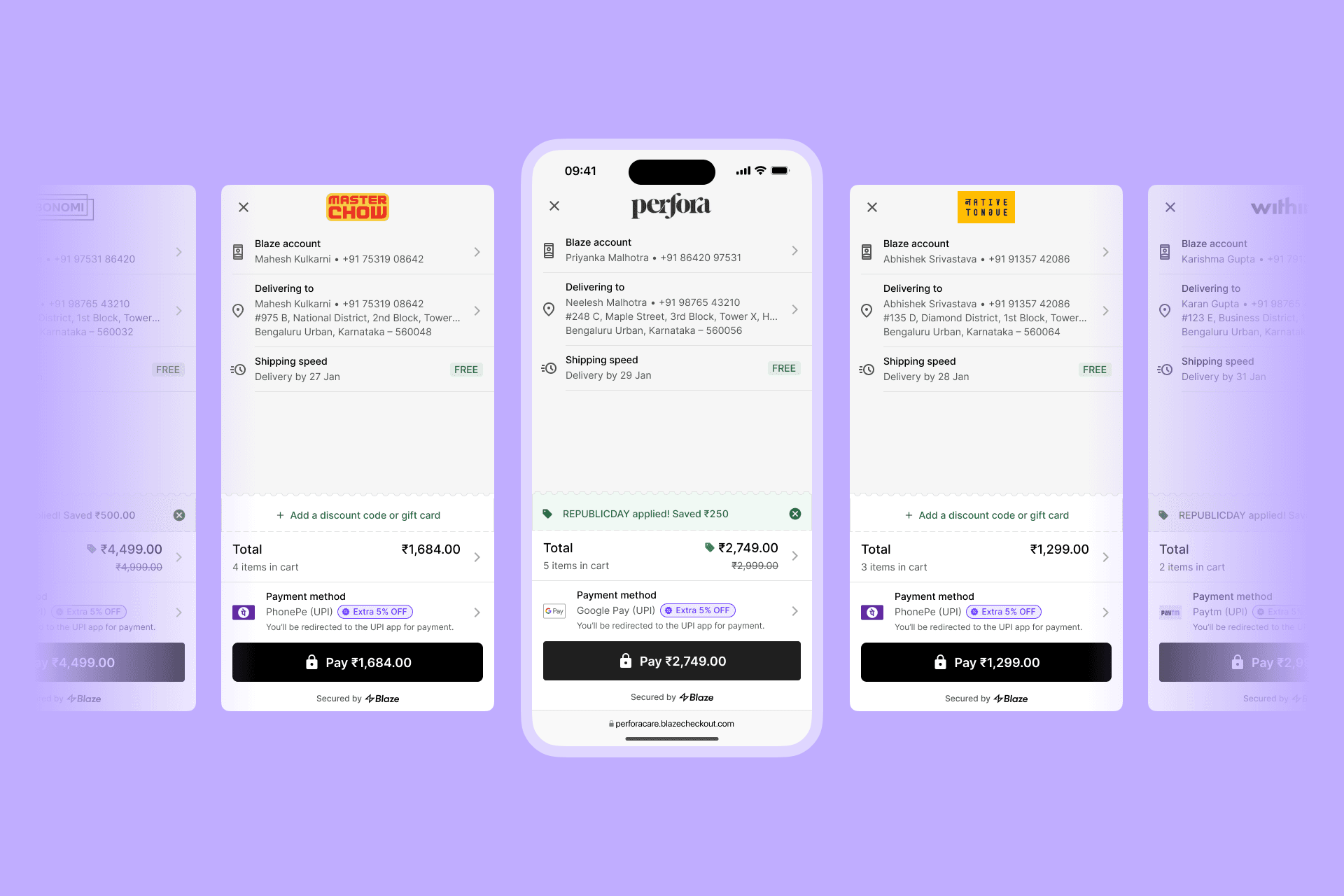
Bureau's network checkout for D2C brands
How Blaze fits in
Blaze sat between the merchant's site and the user's UPI app. When a user tapped Pay, they were redirected to PhonePe, Google Pay, or Paytm to complete the transaction, then returned to Blaze for confirmation. That confirmation depended on a webhook callback from the payment gateway. Usually fast, sometimes delayed.
The problem
We onboarded 12 new merchants in early January, taking us from 11 to 23. At that scale, a hidden issue surfaced: same complaint, different brands.
"UPI app says paid. Checkout says processing."
The funnel data was healthy. Payments were completing. But support tickets told a different story.
What was actually broken
UPI payments are instant. The webhook callback to our server isn't always.
During Republic Day traffic, users would complete payment in their UPI app, see "Payment Successful," and return to Blaze. But our screen was still spinning.
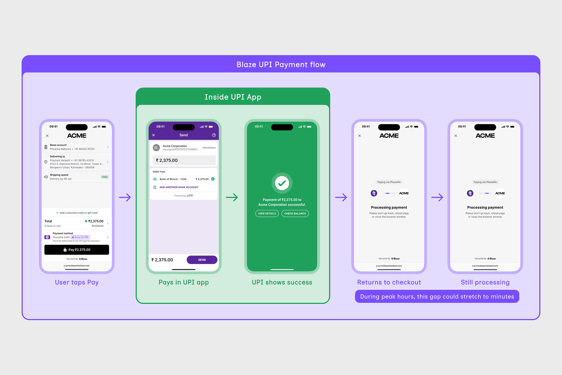
UPI success ≠ merchant confirmation
For a first-time buyer on an unfamiliar brand, money gone, screen frozen, it meant one thing.
"Did I just get scammed?"
I pulled callback logs. 3–5% of transactions during peak hours had delayed confirmations. A small slice of traffic, but a disproportionate share of support tickets. The webhooks were infrastructure I couldn't speed up. But I could design for the wait.
What I ruled out
The most obvious fix: change the copy based on elapsed time.
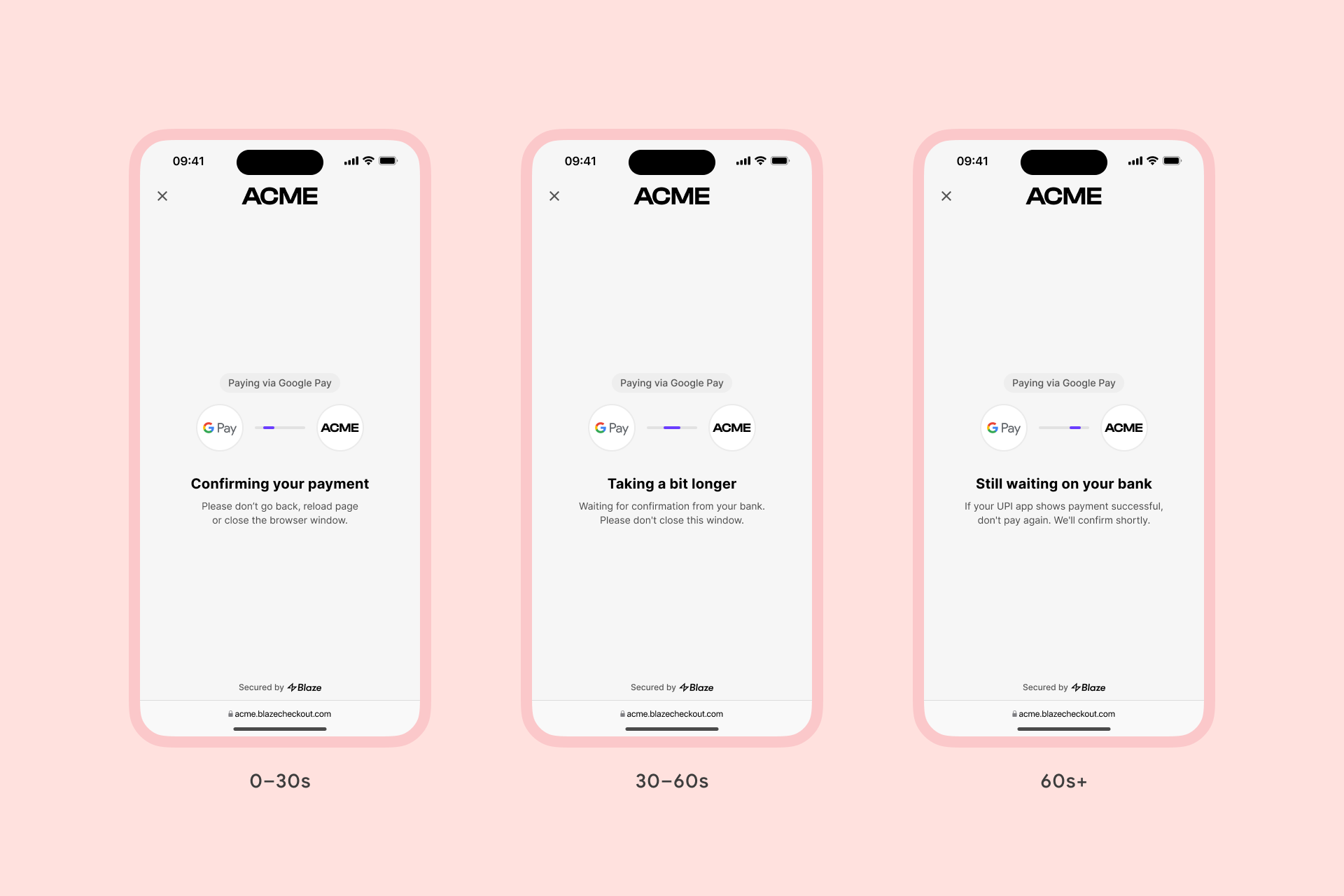
At a glance, nothing changed
Three states, three copy variations, identical visual hierarchy. To a panicking user not reading carefully, all three screens looked the same.
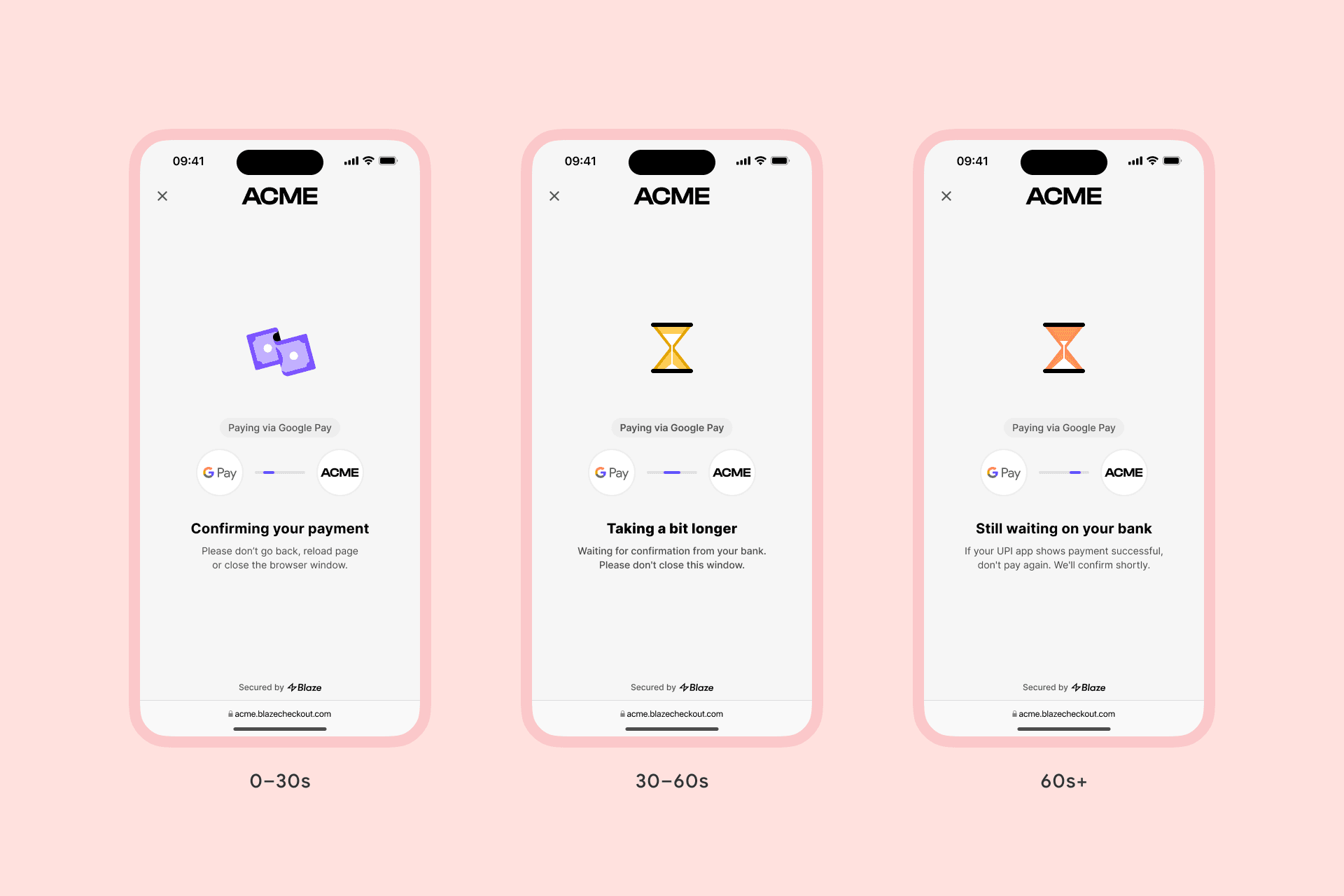
Better than text, still easy to miss
Adding spot illustrations was a step up but still easy to miss in the moment of panic. Both attempts had the same problem: they were digital solutions to a digital problem.
I needed to look at how this moment plays out in the real world.
The bridge: how Indian shopkeepers wait
UPI payments via QR are everywhere in India: kirana stores, chai stalls, autos. When you pay and the money leaves your account but hasn't reached the shopkeeper yet, you both do the same thing: stare at your phones, waiting together. The shopkeeper doesn't pretend everything's fine. They check alongside you. And when the payment lands, they smile and thank you.
That was the interaction missing from digital checkout. Not a fix for the delay. An acknowledgment of it.
The solution: designing for uncertainty
The interface needed to respond to elapsed time, not treat payment as binary.
Emotional mirroring: seeing your concern reflected reduces anxiety more reliably than reassurance does.
Character mirrors user anxiety as wait time increases
The shopkeeper checks his phone with you. At 30 seconds, confident. At 60, concerned. Past that, worried, but never panicked. The expression carries the message before the copy does.
And when payment finally confirms:
Payment confirmed, shopkeeper smiles
A namaste, borrowed directly from the kirana store moment of "thank you, come again." Users don't just see a success message. They get acknowledgment.
The pushback
The PM raised a fair concern: "Won't showing concern make users more anxious?"
The risk was real. Mirror panic and you amplify it. I prototyped the worry state deliberately restrained: furrowed brow, slight frown, never alarmed. Then walked him through the kirana analogy alongside the prototype. The static argument hadn't moved him; seeing the worry expression dialed down to concerned, not panicking did. We shipped.
Before & after
The confirmation screen now responds to wait time
Result
The fix shipped on January 25th, mid-Republic Day sale. Discovery, design, and ship happened in a single sprint.
27.41% fewer payment-related support tickets, comparing the week before launch to the week after.
27.41% fewer
Payment-related support tickets across 12 of 23 merchants
A note on the data: 12 of our 23 merchants tracked support tickets by category and agreed to share the data with us. The remaining 11 either didn't categorize or didn't share. Not a self-selected subset. Across all 12, the directional shift held.
What I'd do differently
Talk to users directly. I designed from merchant feedback and product intuition. A few mid-checkout interviews would have validated, or challenged, the approach.
Track refresh behavior. We warned users not to reload, but didn't measure how many did. That data would have strengthened the case for time-aware design.
A/B test the character. I believe the shopkeeper added something copy alone couldn't. I can't prove it. A simple test would have answered whether emotional mirroring required illustration, or just honest copy.
The takeaway
Waiting isn't binary. Interfaces shouldn't be either.
When the system can't deliver certainty, the interface can still deliver acknowledgment. Designing for the slow path (the 3–5% on the wrong side of an infrastructure delay) is often where trust is actually built or broken